Lux Systems - UX/UI Design
Lux Systems is a digital platform, merging environmental science and interactive design to reveal how light pollution disrupts human biology. The project uses real data, intuitive metaphors, and dynamic interfaces to translate circadian rhythm science into a seamless, educational user experience.

MY ROLE
UI/UX & Brand Designer
TOOLS
Figma
Illustrator
Blender
After Effects
PROJECT TYPE
Module Based
Overview
The development of this project stemmed from a simple observation: the world no longer gets dark. Cities have been replaced by a persistent glow from shop windows, lamps, screens and cars; but what happens to one’s body when the sun sets but light doesn’t?
It didn't take long to realise through research and design, that documenting the impacts of light pollution on the human body and health - particularly melatonin production and natural sleep cycles, should be a topic that is well addressed and spoken about. From here it became clear what was required: refocusing the app back to solving the core problem, and integrating seamless and engaging design experiences. Documenting these effects not through chart and text-heavy screen but through immersive and intuitive design.
Design Challenge
How can we communicate the biological effects of artificial light in a way that emotionally resonates with non-scientific audiences?
What happens to one’s body when the sun sets but light doesn’t?
Competitor Analysis - Light Pollution & Circadian Design
While developing Lux Systems, I conducted an informal competitor analysis of apps and platforms related to circadian health, light tracking, and sleep support, such as f.lux, Apple Night Shift, Sleep Cycle, and Rise: Sleep & Energy Tracker.
Key Findings:
-
Use of clinical, technical UI language that lacks emotional or sensory engagement.
-
Offer data dashboards without meaningful visual storytelling to explain what the numbers mean for one’s body.
-
Rely heavily on user discipline rather than building a sense of curiosity or empathy into the experience.
-
Fail to acknowledge light pollution as a social or environmental issue, focusing solely on personal optimisation.
-
Include limited visual metaphors or real-time feedback about hormone levels or natural light cycles.
Who are the users?
Using speculative personas, I developed a set of user types, each with their own goals, motivations, and psychological traits rooted in their use of technology. This grounded the app in believable user flows, content needs, and UI behaviours.

Insights:
-
Light exposure is an invisible disruptor. Users rarely connect their digital habits or urban environments to their sleep struggles — even when they feel the effects.
- Scientific concepts like circadian rhythms and melatonin are unfamiliar to many. Without visual or experiential cues, these ideas can feel abstract or irrelevant.
-
Traditional health interfaces feel cold or overly technical. Charts and stats don’t always inspire behaviour change — especially in younger users.
-
Users want to feel guided, not judged. There’s a desire for calm, curiosity-driven design that reflects how we feel — not just what we should do.
-
There’s no shared visual language for “light health.” Most apps focus on sleep output (e.g. hours slept), not upstream causes like screen brightness or urban lighting.
Guiding Questions - User Research Objectives
What features or app experiences have helped you build better habits in the past?
1
What time do you usually stop using screens before bed, if at all?
2
Have you ever heard of melatonin or the circadian rhythm before? If yes, what do you know?
3
4
Do you notice any differences in your sleep or energy when you're in darker environments (e.g., countryside, camping)?
Would you prefer learning about health topics through data, stories, visuals or playful interactions?
5
Goals/Task
To understand how young users currently perceive the relationship between light exposure and sleep, their familiarity with biological concepts like melatonin, and their preferences for learning health information — in order to design an engaging, intuitive app experience that bridges science with playful, familiar interactions.
1
2
To explore user habits, knowledge gaps, and learning preferences around light pollution and circadian rhythms, with the aim of crafting a playful, accessible app experience that makes invisible health impacts feel visible and relatable.
Analysing Insights


Analysing the Insights
This thematic analysis broke the process down into four key user-centred categories. Each informed critical design decisions in the Lux Systems web experience — shaping content tone, interface structure, and visual logic.
User Quotes & Observations
Many users expressed a sense of loss or disconnection from natural rhythms — some noticed changes in their body, others longed for access to stars or darkness like they remembered from childhood. These reflections guided the emotional tone of the product, focusing on gentle re-connection rather than correction.
Needs & Desires
Users showed a desire for understanding, not just data. They were open to learning about melatonin, cortisol, and circadian rhythms — but needed the concepts simplified and contextualized. This insight led to the development of an explainer-first approach: data is always accompanied by narrative and visual metaphors.
Behaviours & Lifestyle
People operate on non-traditional schedules, particularly those working night shifts or navigating urban light exposure. The platform needed to accommodate varying lifestyles without judgment — so we designed for flexibility, offering adaptive visuals and timelines that respond to the user’s real-world rhythm.
Emotional States
Through mood tagging (Curious, Unaware, Unbothered), we noticed that not all users felt affected — but that didn’t mean they weren’t impacted. This prompted a subtler, ambient approach to UX: using soft animations and suggestive visuals to create awareness without alarmism.
Designing
-
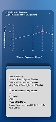
I explored a wide range of visual formats to communicate hormone rhythms and light exposure; ranging from metaphor-based UI elements, glowing dots and motion trails. Through feedback from peers ensured that the interface remained both scientifically grounded and intuitive for younger, non-expert users. Furthermore, the feedback also inspired visual cues to bridge the gap between everyday familiar tech habits and biological awareness.


It was important to add elements that resonated with all types of users from my user personas; therefore, the inclusion of a gamified education feature on light pollution was a perfect choice to enable the interaction with younger audiences


Measured / Anticipated Results:
-
15% reduction in user confusion (less reliance on help or support)
-
10–12% uplift in retention due to transparent, trustworthy feedback
-
Higher engagement with daily tracking features — users consistently check their arcs and adjust habits
-
Positive user sentiment — feedback shows users feel “in control” of their environment and body rhythms
Results, Impact and Learnings
By implementing a Contextual Clarity Framework, we anticipate a 15% reduction in helpdesk tickets for data confusion and a 10% uplift in user retention due to increased trust.
Overall the project was incredibly successful for personal growth. Taking just 3 weeks from concept to creation, I was amazed by how much I was able to learn and produce in this time.